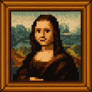
When people think of Minecraft, they think of blocks. But from an artistic perspective, Minecraft is defined by a specific rule: The 16x16 Texture Limit.
It is a common misconception that Minecraft looks "retro." In reality, it doesn't try to look like an old NES game. It has its own unique visual language defined by "Programmatic Simplicity"—a style where clarity, distinct pixel borders, and vibrant colors take precedence over shading techniques like dithering.
At ImageToPixel.art, we help you recreate this iconic "Voxel" look on any 2D image. Here is how the aesthetic works and how you can simulate it.
1. The "Hard Edge" Philosophy
Unlike games from the 90s that used dithering to blend colors smoothly, Minecraft textures are intentionally sharp.
A standard block in Minecraft is wrapped in a 16x16 pixel texture. Because the resolution is so low, every pixel must count. The art style strictly avoids "anti-aliasing" (smoothing edges) or "dithering" (checkerboard shading).
The Goal: You want clear, distinct blobs of color. A pixel of grass is green; the pixel next to it is dark green. There is no blurring between them.
How to set this in ImageToPixel.art:
- Dithering: Set to NONE. This is non-negotiable. Enabling dithering makes the image look like a retro console game, not like a Minecraft block.
- Sharpen: Enable Sharpen (Strength 30% - 60%). This reinforces the "hard edge" look, ensuring that your pixels look crisp and distinct.
2. Visualizing the Grid
One of the most subtle but powerful features of the Minecraft aesthetic is the Pixel Grid.
Because the world is built of cubes, there is an inherent grid structure to everything. Even on a 2D surface (like an item icon in your inventory), there is often a strong outline or a sense of separation between pixel clusters.
How to set this in ImageToPixel.art:
- Pixel Grid Effect: Enable this effect.
- Opacity: Set the grid opacity to a low value (e.g., 15% - 30%). This draws a faint border around every "logical pixel," mimicking the feeling that the image is constructed from individual blocks or distinct texture units.
3. High Saturation for a Vibrant World
Minecraft's Overworld—especially the grass, trees, and sky—is incredibly vibrant. The color palette often uses "color ramps," where a material like wood or stone is shaded using a simple range of 3-4 hues.
To capture that "survival mode" feeling, you need to push the colors beyond reality.
How to set this in ImageToPixel.art:
- Saturation: Boost it to 110% - 130%. You want the greens to look lush and the blues to look deep, just like a high-contrast biome.
- Contrast: Increase to 110% - 140%. This helps define the "sides" of your pixel shapes, simulating the simple block lighting found in the game.
4. The Minecraft Recipe
Want to turn a photo of your house into something that looks like it was built in Creative Mode? Here is the preset to use:
- Pixel Size: Large (8px - 24px). This simulates the "Block" size relative to the screen.
- Dithering: NONE. Keep it sharp.
- Grid: Enabled. This is the secret ingredient for the Voxel look.
- Outline: Enabled (Threshold 30-60). This mimics the distinct borders found on item drops and UI elements.
- Saturation: High. Make it pop.
Minecraft proves that you don't need high resolution to be immersive. You just need clarity, creativity, and a really good grid.
